
モバイルファーストという時代の流れでも、クライアントはやっぱりPCでの表示にこだわってきたりします。というわけで、今回はボタン部分がぶるぶる震えるcssを書いていきたいと思います。マウスカーソルがhover状態になったときに震えるアクションを起こすことで、注目度UP! ただし、震えっぱなしだったり大げさに動きになると、うるさく感じてしまうので設置の際には注意しましょう。
基本となるボタンの作成
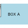
以前、角がめくれるcssを作った時につかったhtmlを利用したいと思います。

<!DOCTYPE html>
<html>
<head>
    <meta charset="utf-8">
    <meta http-equiv="X-UA-Compatible" content="IE=edge">
    <title>buruburu</title>
    <style>
        .buruburu {
            margin: 1rem;
            width: 200px;
            height: 80px;
            background-color: lightblue;
            text-align: center;
            line-height: 80px;
            backface-visibility: hidden;
        }
    </style>
</head>
<body>
    <div class="buruburu">BOX A</div>
</body>
</html>
震える動きを作っていく~その1~
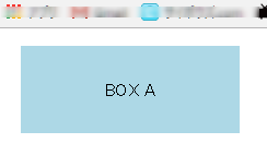
アニメーションとしてしあげるのは最後として、まずは動きを作っていきます。マウスがhoverしたら左右に震えるとなるとtransform:translateX();を使うのが良さそうですね。カッコの中に数値を入れることで、その分表示位置を移動してくれます。ためしにテストしてみましょう。
【css】
.buruburu {
    margin: 1rem;
    width: 200px;
    height: 80px;
    background-color: lightblue;
    text-align: center;
    line-height: 80px;
    backface-visibility: hidden;
    /*test*/
    transform: translateX(50px);
}
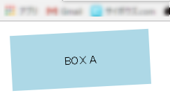
50px分表示位置が移動しました。実際にはこんなに大げさに動かすと度が過ぎるとおもうので、10pxぐらいを最大の振れ幅にします。つまり記述は
    transform: translateX(5px);
    transform: translateX(-5px);
と、プラスマイナス5pxとなります。
震える動きを作っていく~その2~
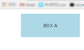
次に横に揺れるだけでは震えている感じがでないので、少し回転させてあげます。回転させるにはtransform:rotate();を使います。角度の指定はdeg単位でおこないます。記述はtranslateXの後、半角スペースをあけて続けて書いていきます。
【css】
.buruburu {
    margin: 1rem;
    width: 200px;
    height: 80px;
    background-color: lightblue;
    text-align: center;
    line-height: 80px;
    backface-visibility: hidden;
    /*test*/
    transform: translateX(50px) rotate(10deg);
}
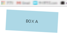
これで角度もつきました。10度の回転でも大げさのようなので、3度程度に調整しておきます。
    transform: translateX(5px) rotate(3deg);
    transform: translateX(-5px) rotate(-3deg);
これで振れ幅は決定。
震える動きを作っていく~その3~
いよいよアニメーション処理を考えていきましょう。まずはアニメーション用の準備をしていきます。
- animation-nameでアニメーションの動きを設定する@keyframesの名前をきめておきます。animation-name: buruburu;
- 次にアニメーション1回分の長さを指定しておきます。今回は1sです。animation-duration: 1s;
- アニメーションの繰り返し回数ですが、動きを確認したいので、ここでは無限で設定しておきます。animation-iteration-count: infinite;
- 最後にアニメーションのタイミング等の設定。アニメーションの開始速度や終了速度に微妙な揺れとか必要ないと思うので以下の記述を追加しておきます。animation-timing-function: linear;
これらをマウスがhover状態になった時に反映するようにしたいので以下のように記述します。
【css】
.buruburu:hover {
    animation-name: buruburu;
    animation-duration: 1s;
    animation-iteration-count: infinite;
    animation-timing-function: linear;
}
震える動きを作っていく~その4~
いよいよアニメーション部分を作成していきましょう。@keyframesで動きを指定していきます。アニメーション用の名前はburuburuでしたね。
@keyframes buruburu {
}
震える回数は1秒間に5往復としました。なので、1秒間に左右それぞれ5回動くので、合計10回。つまり、10%刻みで指定してあげます。
@keyframes buruburu {
    10% {transform: translateX(5px) rotate(3deg);}
    20% {transform: translateX(-5px) rotate(-3deg);}
    30% {transform: translateX(5px) rotate(3deg);}
    40% {transform: translateX(-5px) rotate(-3deg);}
    50% {transform: translateX(5px) rotate(3deg);}
    60% {transform: translateX(-5px) rotate(-3deg);}
    70% {transform: translateX(5px) rotate(3deg);}
    80% {transform: translateX(-5px) rotate(-3deg);}
    90% {transform: translateX(5px) rotate(3deg);}
    100% {transform: translateX(-5px) rotate(-3deg);}
}
これでいったん動きをみてみます。
↓
左右への揺れ、ちょっとおおげさですがあとは移動と角度を調整すれば大丈夫そうです。
現在のコード(コピペで試してみてください:Chromeにて動作確認)
<!DOCTYPE html>
<html>
<head>
    <meta charset="utf-8">
    <meta http-equiv="X-UA-Compatible" content="IE=edge">
    <title>buruburu</title>
    <style>
        @keyframes buruburu {
            10% {transform: translateX(5px) rotate(3deg);}
            20% {transform: translateX(-5px) rotate(-3deg);}
            30% {transform: translateX(5px) rotate(3deg);}
            40% {transform: translateX(-5px) rotate(-3deg);}
            50% {transform: translateX(5px) rotate(3deg);}
            60% {transform: translateX(-5px) rotate(-3deg);}
            70% {transform: translateX(5px) rotate(3deg);}
            80% {transform: translateX(-5px) rotate(-3deg);}
            90% {transform: translateX(5px) rotate(3deg);}
            100% {transform: translateX(-5px) rotate(-3deg);}
        }
        .buruburu {
            margin: 1rem;
            width: 200px;
            height: 80px;
            background-color: lightblue;
            text-align: center;
            line-height: 80px;
            backface-visibility: hidden;
            /*test*/
            /*transform: translateX(5px) rotate(3deg);*/
        }
        .buruburu:hover {
            animation-name: buruburu;
            animation-duration: 1s;
            animation-iteration-count: infinite;
            animation-timing-function: linear;
        }
    </style>
</head>
<body>
    <div class="buruburu">BOX A</div>
</body>
</html>
ただ、これだと「震えている」というよりは「揺れている」という感じなので、アニメーション時間を短くしてみます。
animation-duration: 0.5s;
これぐらいだと震えいる感が出てますね。ためしに、アニメーションの繰り返しも無限から1回に変更しておきます。震えっぱなしではウザいですからね。。。
animation-iteration-count: 1;
震える動きを作っていく~その5~
最終仕上げとして、減衰させるようにしてみます。最初に大きく震えて段々と収まっていくようなアニメーション。実際には100%のときにはほとんど動いていない状態になるように数値を調整するだけです。簡単ですね! というわけで、下のように変更してみました。
@keyframes buruburu {
    10% {transform: translateX(5px) rotate(3deg);}
    20% {transform: translateX(-5px) rotate(-3deg);}
    30% {transform: translateX(4px) rotate(2deg);}
    40% {transform: translateX(-4px) rotate(-2deg);}
    50% {transform: translateX(3px) rotate(1deg);}
    60% {transform: translateX(-3px) rotate(-1deg);}
    70% {transform: translateX(2px) rotate(1deg);}
    80% {transform: translateX(-2px) rotate(0deg);}
    90% {transform: translateX(1px) rotate(0deg);}
    100% {transform: translateX(-1px) rotate(0deg);}
}
まとめ
震えるボタンを作っていきましたが、いかがでしたでしょうか? まあ、実際はボックスなんですけどね。cssでのアニメーションは手軽で動作も軽いので、ちょっとしたアクセントに使うのにぴったりだと考えています。今回も最後にコードを載せておきますので、コピペして試してみてくださいね。
<!DOCTYPE html>
<html>
<head>
    <meta charset="utf-8">
    <meta http-equiv="X-UA-Compatible" content="IE=edge">
    <title>buruburu</title>
    <style>
        @keyframes buruburu {
            10% {transform: translateX(5px) rotate(3deg);}
            20% {transform: translateX(-5px) rotate(-3deg);}
            30% {transform: translateX(4px) rotate(2deg);}
            40% {transform: translateX(-4px) rotate(-2deg);}
            50% {transform: translateX(3px) rotate(1deg);}
            60% {transform: translateX(-3px) rotate(-1deg);}
            70% {transform: translateX(2px) rotate(1deg);}
            80% {transform: translateX(-2px) rotate(0deg);}
            90% {transform: translateX(1px) rotate(0deg);}
            100% {transform: translateX(-1px) rotate(0deg);}
        }
        .buruburu {
            margin: 1rem;
            width: 200px;
            height: 80px;
            background-color: lightblue;
            text-align: center;
            line-height: 80px;
            backface-visibility: hidden;
        }
        .buruburu:hover {
            animation-name: buruburu;
            animation-duration: .5s;
            animation-iteration-count: 1;
            animation-timing-function: linear;
        }
    </style>
</head>
<body>
    <div class="buruburu">BOX A</div>
</body>
</html>